Primary Flight Display

A mockup showing how a display could be displayed free floating in the cockpit using Augmented Reality.
Introduction
In the Fall of 2013 I took an introduction to Interaction Design class. The first three weeks of this class we studied the crash of Air France flight 447—a flight that tragically crashed mainly due to pilot error. At the end of the three weeks groups of students had to present their ideas for a better flight display that would have helped the pilots understand their situation better and perhaps save the lives of those on the plane.
Independent study
After taking this class I was still intrigued by the case over a year later. I approached my Professor about doing an independent study to see if I could dive deeper into what happened on that flight. Through reading multiple reports I decided to focus on the angle of attack display. This is due to a claim made by the BEA in their official crash report:
4.2.2 Recommendation relating to Certification Angle of Attack Measurement
The crew never formally identified the stall situation. Information on angle of attack is not directly accessible to pilots. The angle of attack in cruise is close to the stall warning trigger angle of attack in a law other than normal law. Under these conditions, manual handling can bring the aeroplane to high angles of attack such as those encountered during the event. It is essential in order to ensure flight safety to reduce the angle of attack when a stall is imminent. Only a direct readout of the angle of attack could enable crews to rapidly identify the aerodynamic situation of the aeroplane and take the actions that may be required. Consequently, the BEA recommends:
Ω That EASA and the FAA evaluate the relevance of requiring the presence of an angle of attack indicator directly accessible to pilots on board aeroplanes.

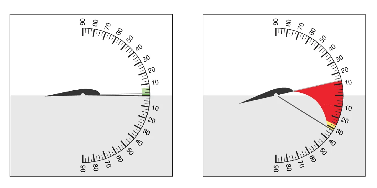
Showing Angle of Attack to pilots
This display shows the current flight path and the pitch of the airfoils in one display. When the angle of attack is generating lift, an area of green is highlighted above the current flight path showing how much the pitch can be adjusted before losing lift. If the pilot exits this safe zone it will turn yellow and the area between pitch and the safe zone will be highlighted in red.
Concept Video
Early Work from 2013 group exercise
The following is the original three week group project. I wanted to leave this up to show how this project originally peaked my interest.
Assignment
For this project we worked in groups to re-envision the primary flight displays used in modern airplanes.
Concept
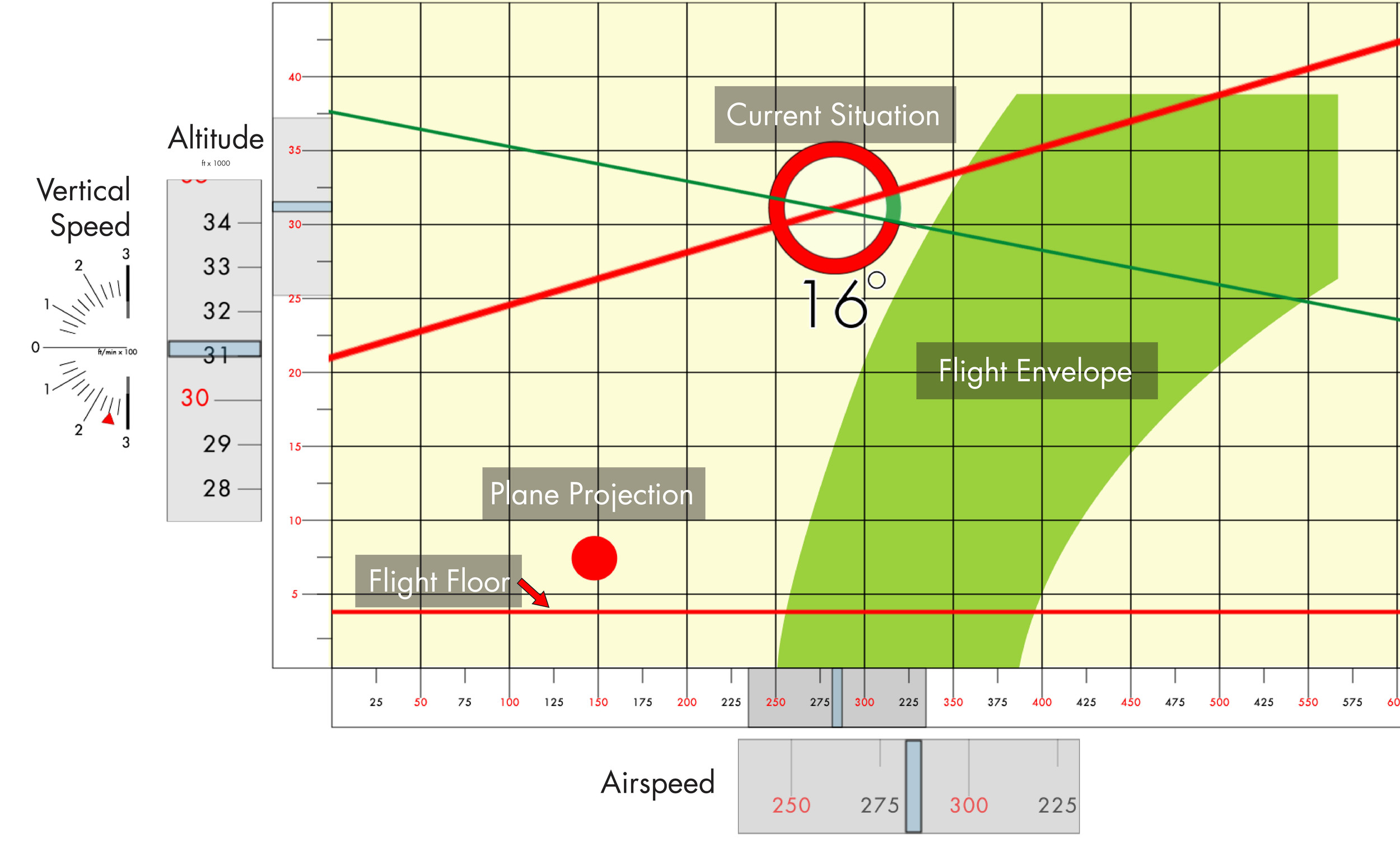
Understanding the Envelope
A plane has very specific conditions in which it can fly; leave this “flight envelope” and the plane will lose lift and begin to fall. Our team’s goal was to create a display that showed the actual flight envelope in terms of airspeed and altitude. The display would also warn the pilot if they were leaving the envelope and give control suggestions to bring the plane back into a safe zone.
Class information
Course
- Introduction to Interaction Design
Professor
- Axel Roesler
Tools
- After Effects
- Illustrator
Group Members
- Chris Curry
- Ciera Johl
- David Yang
- Jum Kim
- Anjelica Harlow
Personal Contributions
- After Effects Animation
- Concept Refinement
- Helped with Illustrations
Research
The case of flight 447
Through multiple lectures and readings about the crash of Air France Flight 447, our group felt that the tragedy might have been avoided with better instrumentation. We believed the pilots in charge were confused about the current state of the plane and therefore took the wrong course of action to correct the situation. If the pilots could have visually seen how the plane was flying relative to the flight envelope, the may have been able to correct the stall and save the plane.
For this project we worked in groups to re-envision the primary flight displays used in modern airplanes.

Original by Der Spiegel